Church Bulletins |
|

50% off Flag Banners only $44.50*
50% off 2’x6’ Standup Banners only $34.50*
30% off 3’ x 5’ Vinyl Banners only $55.30 each*
30% off 2’7"x6’7" Sleeve Banners only $83.30* each
30% off 2’x6’ Sleeve Banners only $69.30* each
Church Bulletins
How To Design and Print Bulletins
Once you have received your Do It Yourself products, it’s easy to get them ready to print. Follow the instructions below
- Prepare Your Information
Collect the information you want to include in your Bulletin. This might include your logo, information about your church, upcoming events, service information, sermon notes, music, and scripture. Designate a section of your ImpactBulletin™ for each section of information. (See template for suggestions.) - Create Your Layout
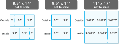
Your Bulletin layout is easy to create in any word processing or desktop publishing program or even using the “cut & paste” method. The enclosed template will give you a guideline for your layout.- Choose a “landscape” (sideways) orientation for either an 8.5" x 11", 8.5" x 14" document or an 11" x 17" document. This can typically be done using a “page setup,” “document setup” or similar function (depending on your software).
- Divide the document into three sections or columns. (See dimensions below.) Typically this can be done using a “page divide,” “page layout,” “page modify” or similar function. Each column should be approximately:

- All margins for each card should be set at 0.25" (top, bottom, left and right). Gutters (empty space between each text column) should be approximately 0.25", and approximately 0.50" for gutters with perforations.
Hint: Use the color changes and color bars of your Bulletinsto help guide your text placement. It is not recommended to place text or logos over parts of the bulletin that have pictures or darker color bars. The perforated section should hold a response card or something you’d like your members and visitors to tear out of their bulletin. - Using your “text box” feature, create a borderless (no frame) box to fit within the specified margins.
- ype in your text and insert any logos. Look at the enclosed sample for ideas about how to position the text and other elements on the inside of the Bulletins. The result should be a simple, clean layout that offers key information without confusion. Make sure each section is clearly titled (i.e. Weekly Events).
- Use no more than two type faces (fonts). One bolder type face for headlines and subheads, and one regular type face for the text work well. Use font variations (bold, italic, light, etc.) to add emphasis and visual variety
without adding graphic “clutter.”
Headlines: 14-20 pt. Text: 10-12 pt.
Headlines: 20-36 pt. Text: 12-14 pt. - Have at least three people proof the layout for errors, content and readability before printing.
- Print
Bulletins may be printed on a laser* or inkjet* printer. However, you may want to output a clean, high quality original of your Bulletin text and duplicate it on a photocopier* or at a local quick printer.
* Before running Bulletins through a laser printer or photocopier, check your owner’s manual for specifications regarding perforated stock.
What Info Should Go on Bulletins
There was a time when bulletins were a fact of life for Sunday services. They were used every week and every person received one on their way in the doors. Sometimes they overflowed with flyers, connection cards, and offering envelopes, and often they ended up in the trash can on the way out.
While usage of bulletins is declining and some churches may see them as “old fashioned” they do play an important role in your church when you’re hosting a lot of visitors - say at Easter, Christmas, and other special worship services. Here is why:
A website, email, phone app or even video announcements are a great way to communicate to your regular weekly attenders but a first time visitor may not have access to those electronic tools and let’s face it, you can’t take a video home with you to review.
As church marketing expert Steve Fogg points out, “Your printed bulletin is brilliant for people who are still finding their way into your church. I know for some of you tech savvy people this feels old and slow. But as communicators we need to communicate at our audience’s pace. Not our own.”
A bulletin for church should be seen as a tool your church can use to reinforce your branding and to communicate with someone who is new to your church family.
What’s the purpose of a church bulletin? A good church bulletin helps guests connect with your church. It tells them who’s who, what activities you offer, and gives them a place to take notes during the service.
The benefits of a church bulletin are three fold:
They are tangible - A church bulletin gives a visitor something to hold onto, which is nice when you feel nervous. Plus if they find your church comfortable and interesting, they may take it home, read it through and use it a as a reference to come to another event.
They reduce the noise from stage - If your bulletin includes all your major events and activities with details including the who, what, where, when, and why of your church, you no longer have to say all of that from stage or in your video. You can just refer people to the bulletin and your website for details.
They tell your story in a short, easy way - Maybe every person in your congregation can recite the mission and vision of your church, but your visitors can learn a lot about the heart of your ministry when it’s in short form in your bulletin. They can also learn where they can go to get more information without having to ask a stranger.
When you put together your bulletin for the week, it’s tempting to include EVERYTHING. But really, you don’t want it to be cluttered or overwhelming. Here are the elements you really need:
- The church’s website address and all of your social media information. You want guests to know where to find you online. If you have an app, you should mention that and tell guests how to download it, too.
- Your physical address and phone number. Remember, they are going to take this home, in a week or two they may not remember these details.
- A welcome message from the pastor that is targeted at visitors. This message should affirm their decision to visit and talk about what the church offers that they may find helpful.
- Some sort of tear-off response card that visitors can complete and drop off for follow-up. It’s a good bulletin idea to offer a gift to the visitor when the card is turned in, or in your follow up letter.
- A listing of important events that cater to the majority of people reading the bulletin (ie: an all-church movie night vs. the over 60 women’s knitting club).
- Staff information - not every pastor and administrator needs to be included, but it’s a good bulletin idea to list children and youth pastors, the speaking pastor, and adult ministry pastor.
- Space for notes - give visitors room to take notes during the sermon or write down things they may have questions about.
That’s it! Creating a good bulletin for church doesn’t have to be complicated. But it can make a big difference to a someone who is visiting your church for the first time.
Creating a Church Bulletin That Gets Read
What is the life span of your church bulletin? Does it last about as long as the service, then find its way into the trash can outside? Then breathe new life into your church bulletin and make it an extremely effective communication tool for your church. Think of it as a mini-newspaper, packed with need-to-know and need-to-grow information that your congregation will treasure.
Click here to choose from over 200 beautiful church bulletin designs, or learn how you can get Free shipping and auto delivery with our Easy Bulletin Subscription Program.
Step 1 — The Look
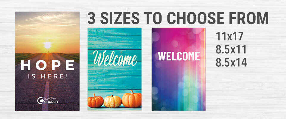
Graphic design is a powerful ally in your quest for an effective church bulletin. An attractive bulletin will draw readers, but a graphically poor church bulletin will be a waste of paper. Outreach, Inc. offers church bulletin shells in 50+ styles and three sizes. These church bulletins are ready for you to add your own text and graphics.
Once you have chosen your size and style, think about the following things:
- How does your church worship bulletin look graphically?
- Is it wall-to-wall typewriter type, or is the print easy to read?
The fewer typefaces (or fonts) you use, the better, so when you begin to add text, choose two or three at most that complement each other. It’s best to mix serif type, (those with small lines on the end of letters, like Times Roman), with sans serif type (those with no small lines, such as Helvetica or Arial). Always use the serif type for body copy, as it is easier to read when there are many words. Save the more elaborate artsy typefaces for short headlines or subheads – and remember, use three at most.
Too much type in any font makes the page look too gray, and people won’t want to read very far. Find different ways to break up the text. Do you employ graphics in your church bulletin? Just like a picture, an illustration is an eye-catcher, drawing the reader into the text. However, with the millions of clip art images that are available, it’s tempting to throw together several images that don’t match or to use too many images. Use moderation and choose graphics that create visual harmony and not chaos.
Step 2 — The Feel
Is your church bulletin full of 20 little sheets of paper that fall out everywhere, or do you use moderation in the content? Put only the most important information in your church bulletin. If there’s too much, you’ll overwhelm today’s too-busy-to-read person. Worse, they'll end up reading it during the sermon! Keep it brief, and refer readers to your website for more information.
Step 3 — The Content
A. New Church
If you’ve got a new church, the worship bulletin is the best and easiest way to help attenders, especially newcomers, know what to expect in the service. If all of the information, such as song lyrics, corporate prayers, sermon topic and order of events are in print, you can put visitors at ease. Plus, the whole congregation will gain a good understanding of how each service will be structured.
Using the newsletter approach is good for a new church, as it educates members on small groups, ministries, prayer groups and other activities that define your church.
Remember to keep your audience in mind. If you’re targeting unchurched people, make your worship folder graphically exciting and avoid using "church speak."
B. Existing Church
Some established churches include the entire outline of the worship service in their church bulletins every Sunday. But if you take a carbon-copy approach, where only the names of the songs and the sermon topic changes, you’ll bore the reader, and your church bulletin won’t get read.
This is where the newsy approach will really pay off. Include information that is important for your congregation to get through the week ahead. You should include:
- Ministry news
- Small group meeting information
- Approaching church events and outside events like concerts or trips to local amusement parks
- Recap past week’s important events, and use names. People love to see their name in print
- Excerpts from books or periodicals that relate to real life issues, such as parenting, relationships, finance and other topics that will provide spiritual growth
- Pictures, if possible. If you have the scanning technology to reproduce a high-quality photo, use it! You’ll have more success in this area if you start with a photo that has good contrast and brightness. As much as people like to see their names, they like to see their pictures even more.
Step 4 — The Feedback
Today’s most successful communication tools utilize interactive communication. Your church bulletin can do that, too. Searching for your next sermon series topic? Ask the congregation what they’d like to see. Wondering if you have enough interest in a new Bible study? Ask them. Want to find out what information your congregation would like to see in the worship bulletin? Ask them.
By giving them a simple survey, which can be collected during the offering or at the end of the service, you’re conveying your desire to be real and relevant in meeting their needs. They’ll be glad you asked, as so will you!
Make a Great First Impression
New! Bulletins now starting at only $6.99 for 100!
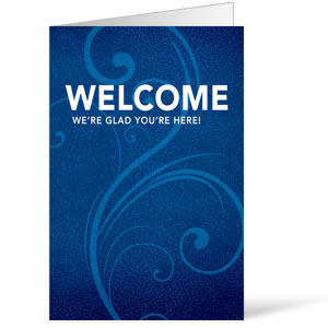
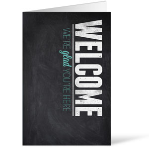
It's the one piece of paper every church visitor will receive, make sure your church's bulletins reflects your vision and mission and connects them to all the ministries in your church. Every Outreach church bulletin shell features eye-catching graphics on the front and room to print your announcements and service information inside.
Subscribe and save! With the Easy Church Bulletin Subscription program your bulletins are delivered four times a year automatically with FREE shipping! Choose from over 250 designs and plan your whole year in under 10 minutes with our easy online manager. Plus you can "Bill Your Church" and pay after you receive each shipment. Try it now!
THE OUTREACH DIFFERENCE:
- Heavy 60 lb paper
- In stock orders ship in one business day
- Free MSWord Church Bulletin Templates for designing your bulletin
- Learn more about creating a bulletin for church that gets read!
Church Bulletins - Compare Costs
| OUTREACH BULLETIN SHELLS |
 |
Design & Print YOURSELF |
|---|---|---|

ANY PRINTER/COPIER with black ink |
 |

A COLOR printer is required |

OVER 100 unique designs to choose from or customize for you church |
 |

YOU have to create your own designs each week |

9 CENTS per bulletin on black/white |
 |

41 CENTS per copy on your color printer |

OUTREACH bulletin shells will SAVE YOU both time and money |
 |

YOU have to spend more time, energy, and money |


